Vente is a conceptual project that I individually worked on the spring of 2020. I was given wireframes and was only responsible for mid to high fidelity screens, branding, interactive prototypes, marketing sites, and a style guide.
My Roles
UX Design Revisits & Elaborations
Visual Design & Illustration
Branding
Design Systems
Interactive Prototyping
Marketing Sites
User Interviews & Testing
Product Details
Vente is a conceptual project, solving the problem of responsive, local, and up to date events close to the user.
The Problem
The local scene is experiencing an overload of shareable information. Today’s consumers are over saturated with local events, meet-ups, and group activities. Despite the endless sea of happenings, people continue their struggle to find activities that align with their personal interests.
What I Was given
Low Fidelity Wireframes
User Personas
The Challenge
In 6 weeks create the visual design for a mobile responsive platform that reimagines how people can search and find activities that reflect their interests. You are required to take user research conducted by a UX team and produce high-fidelity designs. At the end of 6 weeks, you must have a high-fidelity prototype, marketing sites, style guide, and UI kit.
Where i Started
Branding
Vente required me to create all the branding for the product.
In establishing the brand identity of Vente I started with the following...
Moods & Influences
Colours, Style & Feel
Logo Design & Iterations
Moods
With the problem being an event app, I wanted to convey that feeling you get when your waiting under a marquee board for the doors to open, or that live and energetic performance you get at a punk show, bold, and violent.
Style
What ended up coming out of the moodboards, was a sense of high contrast, energetic, bold accents, and hard "analog" edges throughout.
Logo Sketches
Getting a feel for what direction I wanted to proceed with, I began sketching and working out the logo for Vente.
Logo Sketches
Digitization
Final Logo
The final logo version ended up being strong, sharp, bold, and high contrast. It also was the simplest when designing the iterations out.
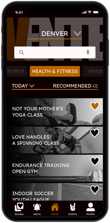
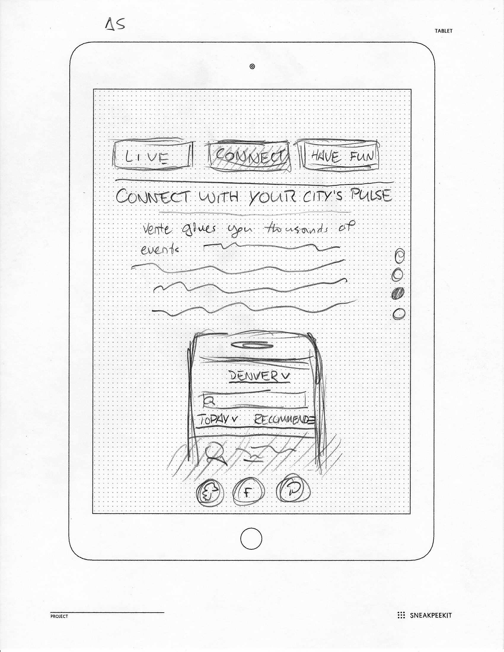
Mobile App
Going from the provided low fidelity wireframes, we then went forward with applying our brand styling to the app itself using Adobe Xd.
Drafts
The very first drafts were taken almost directly from the wireframes given. Text styles and colours were applied, with little revisists to the UX flow at this point.
With my final prototype user tests, there is a bit to still touch on. The flow in general could be cleaned up. Users stated it as being too many steps for a result. Then, in addition, there were some design elements that didnt necessarily communicate clearly enough, such as menu items and selectors.
If I had More Time
I feel like if I had more time with this project, I would have actually built the marketing site. I also would have continued to work outany issues found in testing and keep working to make it as polished as I could.


.gif)
.gif)


.gif)

